Afraid of Color? Your Walls Aren't — And Neither Are the Best Designers Working Today
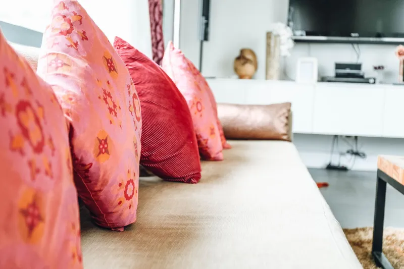
Walk through any major furniture showroom in America right now and play a little game: count the number of sofas in shades of white, ivory, beige, gray, or greige versus everything else. In most stores, the ratio will run somewhere around 8-to-1 in favor of the neutrals. Maybe worse.
This isn't an accident. It's a symptom.
Somewhere along the way — probably around the time open-concept homes became the default and Instagram made everyone a part-time interior designer — American homeowners collectively decided that color was risky. That a bold sofa was a statement you might regret. That the safest bet was always, always, the light gray linen.
The result? A generation of living rooms that look like they're waiting for something to happen.
The Psychology of Playing It Safe
Let's be honest about what's driving the neutral obsession, because it's not purely aesthetic preference. It's fear — and a pretty specific kind of fear at that.
First, there's resale anxiety. The idea that a colorful room will scare off future buyers has been hammered into American homeowners so thoroughly that many people make decorating decisions based on hypothetical strangers who may or may not ever walk through their door. This is a real thing real estate agents say, and it has genuinely colonized the way we think about our own homes.
Second, there's the permanence problem. A navy sofa feels like a bigger commitment than a gray one because it's harder to imagine it working in a different context. Gray goes with everything, the logic goes. Blue goes with... blue things? The fear isn't irrational — it's just based on a narrower imagination than most of us actually have.
Third — and this one's a little uncomfortable — there's social conformity. When everyone around you has a neutral living room, a bold one starts to feel like a personality claim you might not be ready to make. Color communicates something. And some of us would rather communicate nothing than risk communicating the wrong thing.
None of this makes us bad people. But it does make our homes less interesting than they could be.
What Designers Are Actually Doing Right Now
Here's the thing about the neutral wave: the designers who set trends stopped riding it a while ago.
Look at what's coming out of the studios and showrooms that actually move the needle — firms in New York, LA, and Chicago that work with clients who give them real creative latitude. You'll see deep terracotta sectionals anchoring living rooms. Cobalt blue credenzas in dining spaces. Forest green velvet chairs that stop a room cold in the best possible way. Mustard yellow accent pieces that shouldn't work but absolutely do.
Bold color isn't coming back to contemporary design. It never left for the people who were paying attention. What's changed is that the broader market is finally catching up — and the options available to regular shoppers have never been better.
Brands like Anthropologie Home, CB2, and a growing number of direct-to-consumer furniture companies are investing heavily in color. Not just accent pillows and throws — actual upholstered seating, lacquered case goods, and statement lighting in shades that have no business being called neutral. The supply is there. The demand is what needs coaxing.
The Real Cost of the Neutral Default
There's a version of this conversation that's purely aesthetic — boring rooms, missed opportunities, blah blah blah. But there's a more interesting argument underneath it.
Color in a living space has a measurable effect on mood, energy, and how comfortable people feel in a room. This is not fringe psychology — it's been documented extensively in environmental design research. Warm tones create a sense of intimacy. Saturated colors can increase alertness or energy. Cool greens and blues tend to reduce perceived stress. The specific effects vary by shade, context, and individual sensitivity, but the general principle is solid: color does something to us.
When we strip color from our homes in the name of safety, we're not just making a neutral aesthetic choice — we're opting out of a design tool that could genuinely make our spaces feel better to live in. That's a real trade-off, and it's worth naming.
A Framework for Introducing Color Without Losing Your Mind
Okay. You're interested. Maybe even a little inspired. Here's how to actually do this without ending up with a living room you hate by February.
Start with a piece, not a palette. The biggest mistake people make when trying to incorporate color is trying to plan the whole room at once. Start with one piece you love — a chair, a rug, a credenza — and build from there. Constraints are creative. Give yourself one bold anchor and let the rest of the room respond to it.
Use the 60-30-10 rule as a starting point, not a law. The classic interior design formula (60% dominant color, 30% secondary, 10% accent) is useful scaffolding. If your walls and large furniture are relatively neutral, your 10% accent can go genuinely bold without the room feeling chaotic. That 10% is more powerful than you think.
Don't confuse 'bold' with 'bright.' Some of the most sophisticated color choices in contemporary design are deep, moody, and complex — not bright. A charcoal-teal sectional reads as bold without being loud. A terracotta armchair is rich without being garish. Bold color is about saturation and intention, not necessarily intensity.
Test before you commit — but actually test. If you're considering an upholstered piece in a color you're nervous about, get a swatch and live with it for a week. Put it near the window. Look at it under your specific lighting at night. The color on your screen and the color in your room are two different things, and the only way to know which one you're getting is to look at it in context.
Give yourself an exit ramp. If the idea of a bold sofa still feels terrifying, start with a piece that's easier to replace — a rug, a set of dining chairs, a pair of side tables. Build your color confidence on lower-stakes items before you commit to a centerpiece.
The Permission Slip You Didn't Know You Needed
Here's the bottom line: the neutral room isn't the smart choice. It's just the scared choice dressed up in good lighting and a linen throw.
Your home is not a model unit. It's not a listing photo. It's the place where you actually live, and it should reflect something real about who you are and how you want to feel when you walk through the door. If that something happens to be a warm ochre sofa or a deep plum accent wall — good. That's design doing what it's supposed to do.
The best contemporary furniture available right now comes in colors that would make a beige sofa blush. You've got options. The only thing left is the nerve to use them.


